
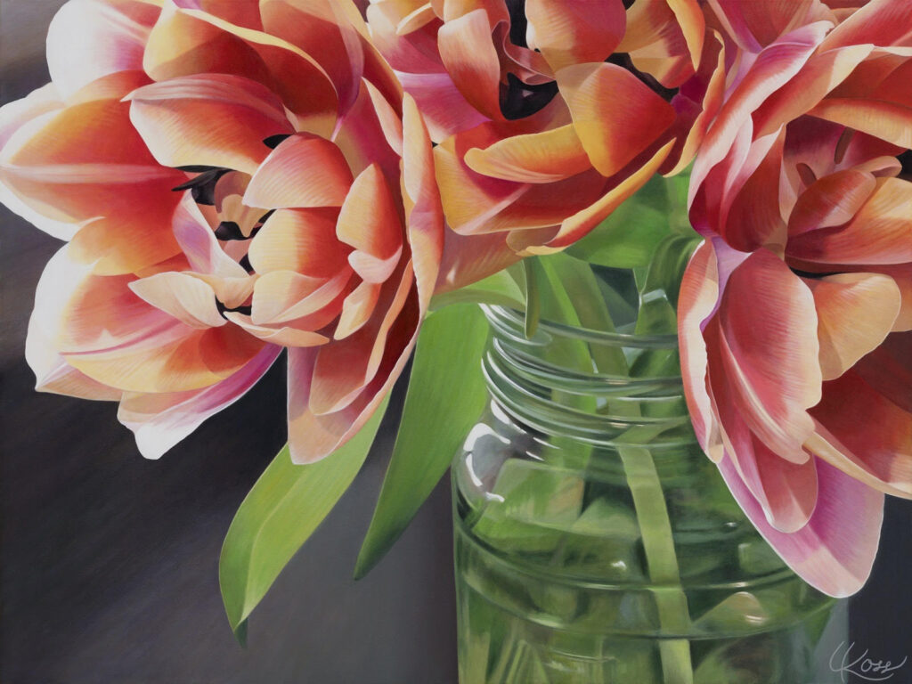
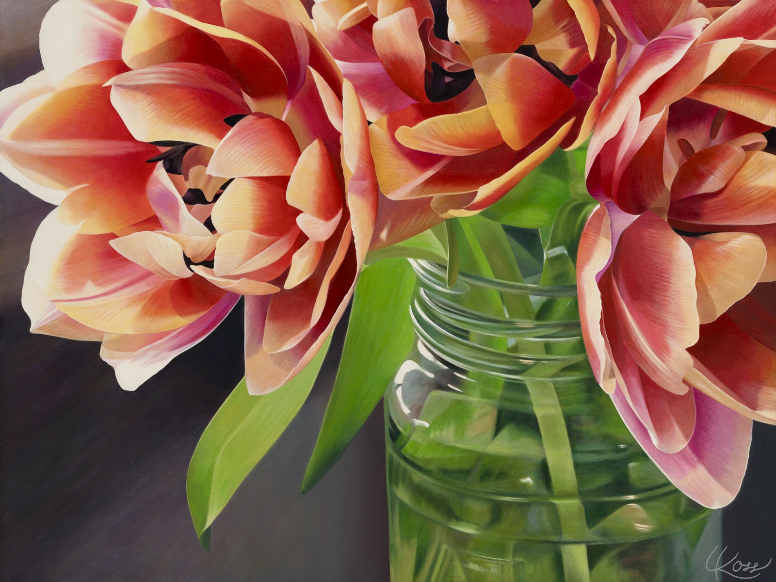
If you paint with black, you rely on a “colour” that does not exist in nature. When discussing black in terms of science, it is the absence of light. And for me, painting is always about the light. (See my previous blog post). As an artist who paints flowers, I avoid using black as I want to capture the true essence of nature. My tulip painting at the top of this post was painted without black, using only primary colours and white–because there is no actual black in nature. You might remark that a burned tree stump in a forest is black. True, but if you look closely, it is comprised of various dark colours. Not black. If you want to paint a cave—deep inside where there is no light—then yes, black would be your “colour!”
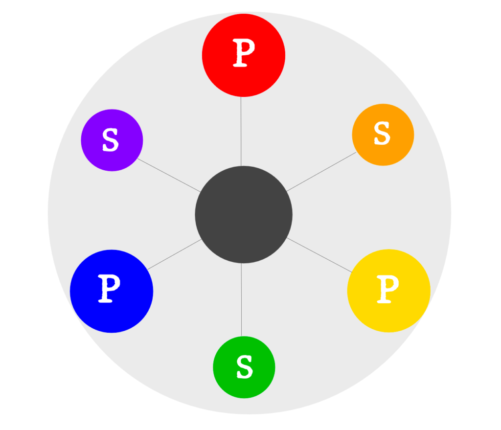
I put “colour” in quotation marks when referring to black because black isn’t a colour. It’s a shade. And it’s a shade that many fine artists avoid because it tends to be harsh, deadening, and dull. Instead, mixing dark tones using the complements on the colour wheel will produce natural black-like colours that are richer, more alive, and more interesting. Note: complementary colours are the set of primary and secondary colours across the colour wheel from each other—blue and orange, red and green, violet and yellow.
Basic Colour Wheel (P=primary; S=secondary):
With the addition of white—which is a tint—you can produce dynamic greys using the complementary colours that have far more life and depth than if you rely on black and white. (Don’t forget that representational painting is always about creating depth. You want your viewer drawn into your painting and their eye to move around the composition, maintaining their interest).
One of the most important aspects of being an artist is learning to look at the world around you. If you look closely, you will see that those areas you thought were black actually have much more depth and colour to them. It is a good practice, especially if you are new to art, to avoid using black to learn how to really look—and to learn how to mix the variety of colours and tones you want to represent in your paintings.
Remember that all “rules” are made to be broken, and if you are beyond the beginner stage and want to use black in your representational paintings, I say, go for it. Black can be hard to work with, however, so try to use it sparingly. Black can quickly dominate a painting and make elements appear dull. And as a general rule, you want your paintings to be alive and to have a feeling of depth. Having said that, if your style is non-representational, then the opposite applies to you. Since the goal of non-representational art is to reject a sense of depth, black is perfect for that!
So next time you sit down to paint, why not try painting without black? At the very least, you will get excellent practice mixing the complementary hues of the colour wheel to produce a variety of vibrant and more natural-looking “blacks” and greys.
Happy painting!